

Coloring Tips
 Color is a powerful tool, which can help you to tell a story, convey a mood and draw viewer's attention. But at the same time, coloring is the most tricky part in creating your own artworks. Here are some general tips, that will help you improve your adding color process.
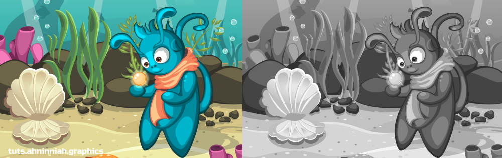
1. Use shades of grey as a color palette. Many artists use grayscale in order to add good volume without distracting on choosing colors. Color is added later. It also helps to achieve a good color contrast between objects.
2. The more different colors you choose, the more difficult to focus on the image. Very often, colors are used to highlight objects that represent an area of interest on the image. If image is overflowed with different saturated colors, a viewer will have to make an effort to make out your image properly.
3. It's important how colors combined with each other, rather than their number. Make sure that your colors create a good combination. If not - select from adjacent colors (using color wheel) or play with their saturation and brightness (HSL color model). In Inkscape, you can deal with it using Fill and Stroke dialogue (Shift+Ctrl+F)
4. Use color palettes. Before coloring I often visit www.colourlovers.com in search of inspiration. But this is just your starting point. It's a rare case when all the colors from the palette will be useful to you or will be suitable for combinations the way you like. In most cases, all colors from one palette do not work well together.
5. There are cold and warm colors. It’s a good practice to combine both types of color. The coldest color is deep blue, the warmest is yellow. The more yellow shade of color you have, the warmer your color will be and vice versa.
6. Represent distance through color. The closer object has more saturated colors. The further one, is bright/light and dim. Good example is saturated background and saturated character of a platformer-game. It'll be very difficult to distinguish the character on such background, particularly in action. And another issue, if we have saturated background and dim character, then our area of interest will be background, not the character.

7. Convey the mood. Emotions can be described through colors. Bright, saturated colors describe positive emotions, joy and movement. Negative emotions, sadness, represented through dark tones and less saturated colors.
8. Pure white & pure black: use pure white for very bright and reflective surfaces or effects. Use pure black for an outline. For shadow, it’s better to use dark purple or dark blue with 20-30% of opacity.
9. Take care of the details later. This tip can be applied to creation of outline and adding color. Place the main colors on the drawing, and then proceed to details and adding volume.
10. Always check the result at the actual device. It might look good at your monitor, but each monitor has different color display setting. Actual device (if you create an art for your mobile game) will show you colors in action. Of course, ideally you should calibrate your monitor, but it can be challenging task to perform.
Inkscape

-
Pick colors from image. You might want to use colors from a reference photo or other image. Color Picker (F7) will help you in this. Select the object you want to fill with color, and click on the desired color from the reference with Color Picker. Click and hold Shift to fill the stroke with color. Also, this tool has a useful function - averaged color. When you click and drag with Color Picker, you will see a circle. If you have two or more colors inside this circle, you'll set an average color for your object.
-
Inkscape has a great set of color extensions, that might help you to achieve the desired result (Extension > Color). For example, More Saturation, Brighter or Grayscale (for checking added volume or good color contrast) - there are many of them for your experiments.
Duplicate (Ctrl+D) your object before applying extensions to it. After applying one, and pressing Ctrl+Z Inkscape most likely will complete its work incorrectly. Duplicating is also a good practice in order not to lose the original objects.
- Color palettes and swatches. Inkscape has a huge amount of preset palettes. You can find them, when you click on the black arrow to the right of the Swatches panel. There we can also change the width and the size of the panel. Most often we see an Inkscape Default palette, but there are many variations. Any color palette can be a good starting point, rather than direct guide to use only specified colors.
That’s all for now! If you like the tutorial, please, share it :)